Hi Community,
Would you like to create reports and charts based on how many tasks there are in your Microsoft account? Or to see in a visual layout the statuses of all those tasks at a glance? These options and many more are now available thanks to the newly released Wrike connector of Microsoft Power BI! 📈
Note: This connector is available in the May 2023 release of Power BI Desktop and also in the Power BI Service.
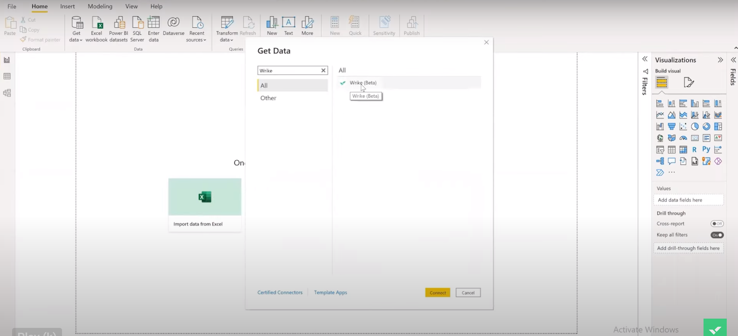
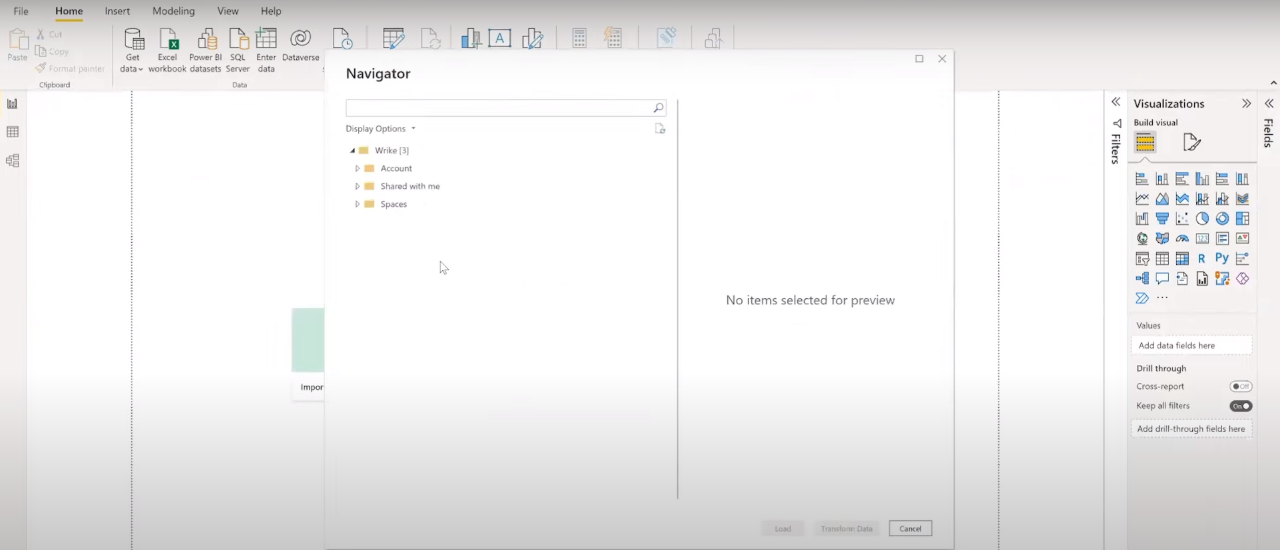
Available for Entreprise Pinnacle accounts, the connector allows you to use Wrike as a data source for Microsoft Power BI with only a few clicks: the connector is available directly in Power BI Desktop’s Get Data options. After authenticating into Wrike through the connector, you will see three main sections to select datasets from: “Account”, “Shared with me”, and “Spaces”.
You can find out further on how to pull Wrike data in Power BI in this step-by-step guide:
https://www.youtube.com/watch?v=2r1COJEcZrA&t=134s
The data objects available through the Wrike Power BI Connector include projects, tasks, custom fields, finance fields, custom item types, timelogs and many more 🤩 You can find the full list here.
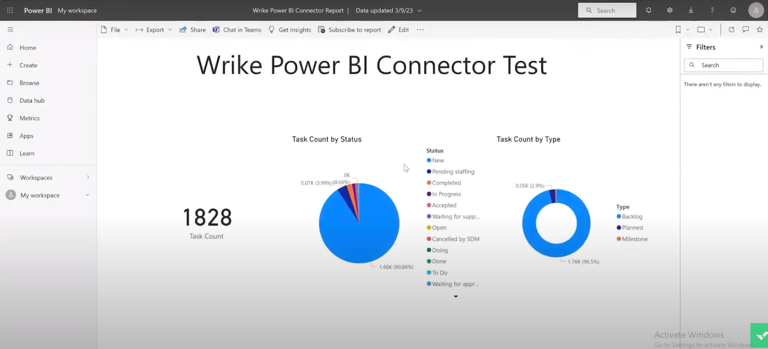
Based on this data, you can create updated reports and multiple charts to visualize how your work is progressing. The range of charts includes bar and column charts, pie charts, doughnut, funnel and gauge charts, and also line charts, among several other options. You can also create multi cards and single cards, which you will find especially useful when needing to count a large number of tasks on your account or Space.
Already excited about the possibilities? Please, share your comments and any questions you might have below 👇
Happy reporting! 📊