Hello Community,
Last year when our team members were notified by email of an action in Wrike, they would see the information they needed as soon as they opened the email (or on their preview). This was super helpful! Team members saw all pertinent information right away and didn't need to scroll down. Once they clicked on the link and went to the task, they could see the description if they needed it and change the status or comment.
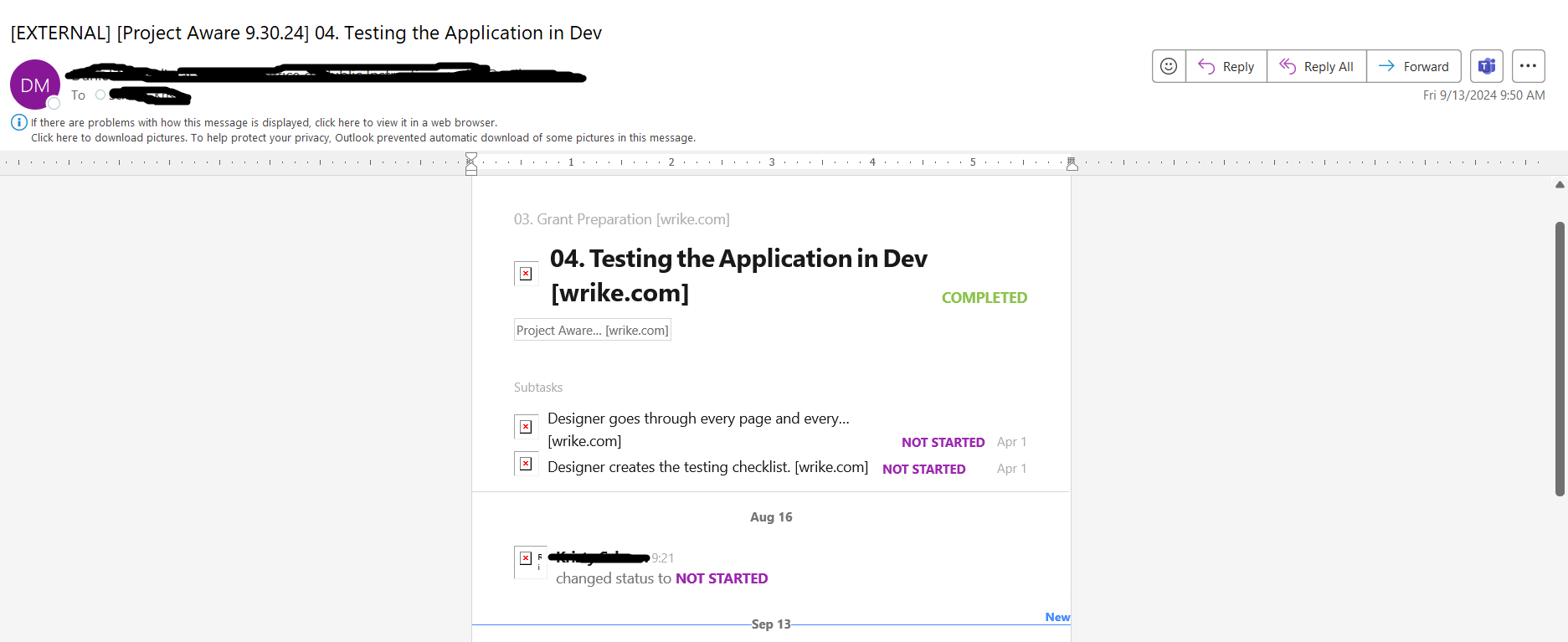
This year, I used custom item types for task creation and that is the only thing I think is different in my process. This is what people see now. The description has taken over the email and obscured the whole message. Obviously this isn't needed by team members who know what they are doing, and for team members who are new, it looks like there isn't any relevant information in the email notification. Is there a way this can be fixed, or if not, is there an alternative place where we can put directions for team members so it doesn't impact the success of the email notification function?