TL;DR: Wrike Whiteboard has a refreshed, more intuitive UI. Navigation is simplified with two modes (hand + arrow), selection is easier, sticky notes have a dedicated toolbar button, and collaboration/presentation tools are grouped together in the top-right. All settings are now in one menu, and the overall look is modernized and aligned with Wrike’s design system to improve clarity and ease of use, especially for new users.
Hello Community! 👋
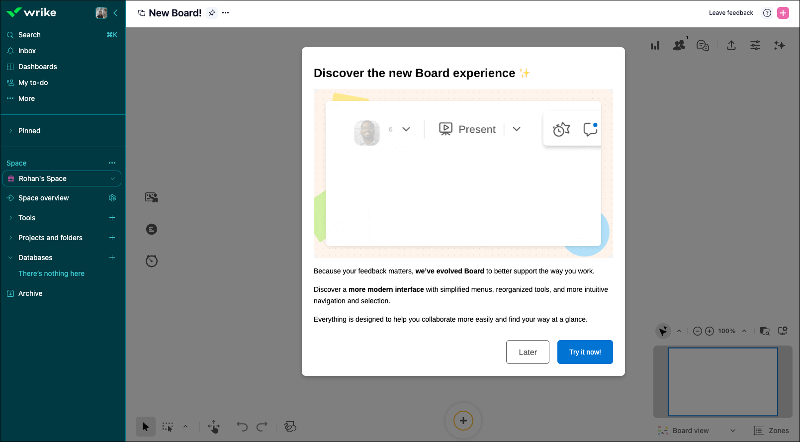
We’re excited to introduce the new Wrike Whiteboard experience – a refreshed UI designed to make working on a board easier, clearer, and more intuitive 💯
Here’s what’s changing 👇
We’ve moved to two clear modes – Hand to navigate and Arrow to select – so it’s easier to move around your board and work with objects from the start.
You can now select empty shapes by clicking inside them, and objects are selected as soon as the selection rectangle touches them.
The old “+” button is gone. Sticky notes (previously “ideas”) now have a dedicated, more visible button in the toolbar, with direct access to colors.
- Collaboration & presentation in one place
Present, interaction tools, Comments (Questions, Dot Voting, Timer) are now grouped at the top right, and connected participants are visible directly in the header.
Personal and board settings are now grouped in a single menu, so you no longer need to search around the interface.
The interface is modernized and visually aligned with Wrike’s design system, while keeping the familiar tools you already use.
These updates are all about clarity, consistency, and ease of use, especially for newer users discovering Whiteboard for the first time.
To know more about Wrike Whiteboard, check out our detailed
Help Center article, and share your thoughts in the comments below! 😄