Hello!
I wanted to share some feedback on the Wrike Labs experiment Redesigned subitems in Item view Feedback. I'm not sure if anyone else has tested it, but I'm curious to hear what y'all think of it, too!
Pros:
- Easier to edit subitems without having to open each one individually
Cons:
- There's no way to customize what shows up here
- Depending on screen size and if the side-menu is open, not all columns display (Start Date gets cut off)
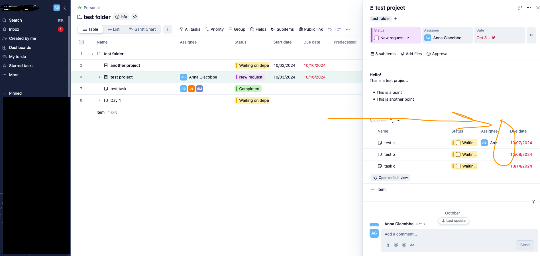
- Status seems a bit “chunky” with the UI design of the label (bold bar on the side of the checkbox) and gets cut off (defeats the purpose of displaying it if we can’t see what the status actually is)
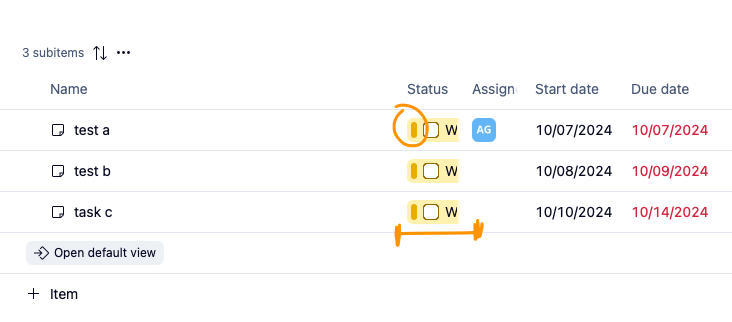
- Field columns get cut off too; see “Assign-” in the previous screenshot
- Can't wrap text - issue for items with long names
Thoughts from my team:
- "I find I need to zoom out to see things better"
- "It's overstimulating"
- "I don't need to see the start date and assignees in a column like that"
Overall, I think the idea of having a more editable UI for subitems is great, but perhaps it would be more user-friendly if it looked sleeker/simpler/less-cluttered (similar to the old design that mimicked List view) and allowed us to show the fields we think are important to show at this level.
Have you tried this redesign? I'd love to hear your thoughts and experiences with it!