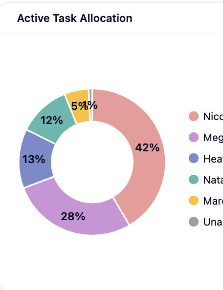
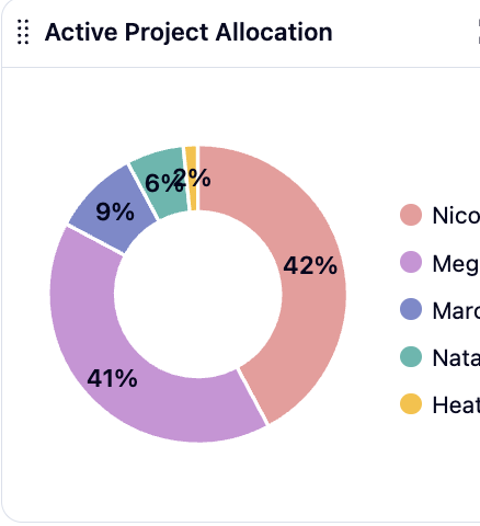
Right now,
the charts / reports you can include in the dashboard use default colors–meaning the highest amount is peach, 2nd highest is purple, 3rd indigo, 4th green etc., regardless of the asignee or whatever other filter you are using.
I want these colors to be consistent by USER for those charts that are filtered this way. Otherwise, it takes more processing time to discern who has the most projects vs who has the most tasks at a glance. So I want user A to always be color A, and user B to always be color B, regardless of their place in the data chart.
Please see images below that show the last 3 users on the lists as different colors between charts. H is blue in chart 1 and yellow in chart 2.